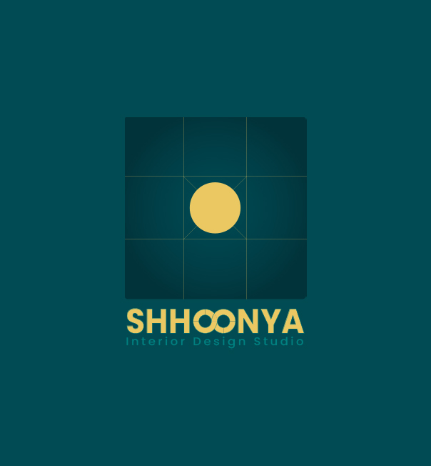
SHHOONYA denotes the ‘Zero’ / ‘Cipher’. In Asian Philosophy, it implies “Nothingness” – the only Absolute, the only Perfection, the centre of all energy.
It is also called the “Bindu” in Hindi or the “Dot” in English – a free entity that moves in all directions symbolising a continual spirit of growth in the sphere of Energy around.
Shhoonya therefore, expresses a Beginning, Growth, Movement, Energy, and a Journey towards Perfection.
It reflects our fundamental belief – All expression starts with that one small point or dot. Dots become lines, which determine all shapes, forms, patterns, textures, and movement in Design. Similarly, points grow to words. There is a constant connection, communication, expression, and evolution at every stage & point of time in life.
OUR BRAND
The LOGO
SHHOONYA reflects the singularity of the Universe, from which everything emerged. The powerful golden yellow dot in the centre symbolises that. The squares denote elements, perfection, and the connections to the four directions. The lines emanate energy, good vibes, voices, and dialogue across the Universe all the time, indicating new beginnings, humility, and perpetual growth towards infinity.
The striking, energetic, teal combines the energy, positivity, serenity, and calmness of both green and blue, and denotes everything that we believe in and work with.
CORE VALUES OF OUR TEAM
Our Approach
EMPATHY – That defines our attitude.
INTEGRITY – That is who we are.
HUMILITY – It’s a foundation, the hallmark of all human connections.
TRANSPARENCY – It’s the only way we know how to work.
PASSION – There is madness to our style. And we are proud of it!
IMPERFECTION – We don’t claim to be perfect but Perfection is what we strive for.